Generate Latex-Friendly Figures with Matplotlib
This tutorial explains how to use Matplotlib to generate figures using the Latex fonts to insert into your Latex document.
Prerequisites
You need to have Matplotlib installed and be able to create a figure with code like (original from this)
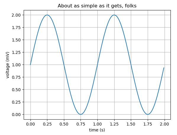
import matplotlib
import matplotlib.pyplot as plt
import numpy as np

# Data for plotting
t = np.arange(0.0, 2.0, 0.01)
s = 1 + np.sin(2 * np.pi * t)

fig, ax = plt.subplots()
ax.plot(t, s)

ax.set(xlabel='time (s)', ylabel='voltage (mV)',
title='About as simple as it gets, folks')
ax.grid()

fig.savefig("test.png")
plt.show()
You also need to have MiKTex installed, which can be done here
Check if this is installed correctly by seeing if xelatex --version in the terminal returns correctly
Setting up your Python Code
Using the example code from above, modify it in the following way
import matplotlib
matplotlib.use('pgf')

import matplotlib.pyplot as plt

plt.rcParams['text.latex.preamble']=[r"\usepackage{lmodern}"]
params = {'text.usetex' : True,
                    'font.size' : 11,
                    'font.family' : 'lmodern',
                    'text.latex.unicode': True}
plt.rcParams.update(params)

import numpy as np

# Data for plotting
t = np.arange(0.0, 2.0, 0.01)
s = 1 + np.sin(2 * np.pi * t)

fig, ax = plt.subplots()
ax.plot(t, s)

ax.set(xlabel='time (s)', ylabel='voltage (mV)',
title='About as simple as it gets, folks')
ax.grid()

fig.savefig("test.pgf")
plt.show()
Let's see what changes we made
First, to change the backend to the pgf format:
matplotlib.use('pgf')These parameter changes affect the font so your figure will have title, axis labels, etc. in the Latex default font.
plt.rcParams['text.latex.preamble']=[r"\usepackage{lmodern}"]
params = {'text.usetex' : True,
                    'font.size' : 11,
                    'font.family' : 'lmodern',
                    'text.latex.unicode': True}
plt.rcParams.update(params)
This saves the figure in the `.pgf` format
fig.savefig("test.pgf")
Inserting the figure into your Latex document
Inserting the figure is very simple. Update the preamble (before the \begin{document}) with:
\usepackage{tikz}
\usepackage{pgfplots}
\pgfplotsset{compat=1.17}
Now in the body of your document put the path of your .pgf file and update the width of the figure to be whatever you choose (\columnwidth and textwidth are good options depending on the format of your document)
\begin{figure}
    \centering
    \resizebox{\columnwidth}{!}{\input{plots/test.pgf}}
    \caption{Caption}
    \label{fig:my_label}
\end{figure}
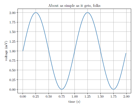
Let's compare the two images:
With Matplotlib Style
With Latex Style
Special Cases
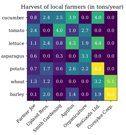
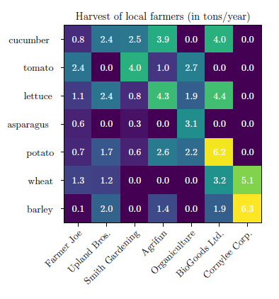
Sometimes when you generate a more complex figure, the output of the savefig.("test.pgf") function call can contain multiple files. Here is an example of that case (original example from here)
import matplotlib
matplotlib.use('pgf')

import matplotlib.pyplot as plt

plt.rcParams['text.latex.preamble']=[r"\usepackage{lmodern}"]
params = {'text.usetex' : True,
                    'font.size' : 11,
                    'font.family' : 'lmodern',
                    'text.latex.unicode': True}
plt.rcParams.update(params)
# sphinx_gallery_thumbnail_number = 2

import numpy as np

vegetables = ["cucumber", "tomato", "lettuce", "asparagus",
          "potato", "wheat", "barley"]
farmers = ["Farmer Joe", "Upland Bros.", "Smith Gardening",
          "Agrifun", "Organiculture", "BioGoods Ltd.", "Cornylee Corp."]

harvest = np.array([[0.8, 2.4, 2.5, 3.9, 0.0, 4.0, 0.0],
          [2.4, 0.0, 4.0, 1.0, 2.7, 0.0, 0.0],
          [1.1, 2.4, 0.8, 4.3, 1.9, 4.4, 0.0],
          [0.6, 0.0, 0.3, 0.0, 3.1, 0.0, 0.0],
          [0.7, 1.7, 0.6, 2.6, 2.2, 6.2, 0.0],
          [1.3, 1.2, 0.0, 0.0, 0.0, 3.2, 5.1],
          [0.1, 2.0, 0.0, 1.4, 0.0, 1.9, 6.3]])


fig, ax = plt.subplots()
im = ax.imshow(harvest)

# We want to show all ticks...
ax.set_xticks(np.arange(len(farmers)))
ax.set_yticks(np.arange(len(vegetables)))
# ... and label them with the respective list entries
ax.set_xticklabels(farmers)
ax.set_yticklabels(vegetables)

# Rotate the tick labels and set their alignment.
plt.setp(ax.get_xticklabels(), rotation=45, ha="right",
rotation_mode="anchor")

# Loop over data dimensions and create text annotations.
for i in range(len(vegetables)):
  for j in range(len(farmers)):
    text = ax.text(j, i, harvest[i, j],
    ha="center", va="center", color="w")

ax.set_title("Harvest of local farmers (in tons/year)")
fig.tight_layout()
fig.savefig("test2.pgf")
plt.show()
Running this code will create two files: test2.pgf and test2-img0.pgf. Let's look at what Line 64 of test.pgf looks like
\pgftext[left,bottom]{\pgfimage[interpolate=true,width=3.110000in,height=3.110000in]{test2-img0.png}}%
As you can see, while generating the figure from the .pgf file, Latex is using test2.img0.png.
Let's say that in my Latex input looks like this again, where both test2.pgf and test2-img0.pgf are in the plots directory
\begin{figure}
    \centering
    \resizebox{\columnwidth}{!}{\input{plots/test2.pgf}}
    \caption{Caption}
    \label{fig:my_label}
\end{figure}
This will fail as is!
You need to modify Line 64 of test2.pgf line to look like this
\pgftext[left,bottom]{\pgfimage[interpolate=true,width=3.110000in,height=3.110000in]{plots/test2-img0.png}}%
Now your figure will render correctly!
Let's compare the two images:With Matplotlib Style
With Latex Style
Sometimes the pgf generator will create multiple image files, such as test-img0.png, test-img1.png., etc. You must modify each path in test.pgf to match the path where the .png files are stored.
And that's it. Enjoy your beautiful figures!
Published: October 2020